Adopt the hand-drawn Napdock mark and a native Mac icon
The site, sign-in page and Mac app now use the hand-drawn Napdock mark, and the app ships an icon that macOS 26 and later draw at full size.
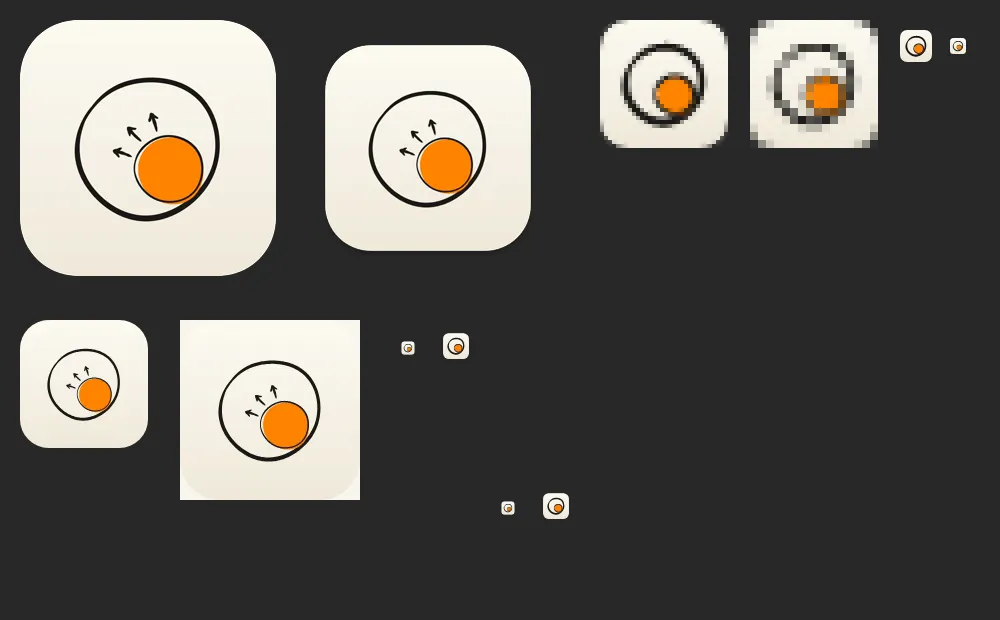
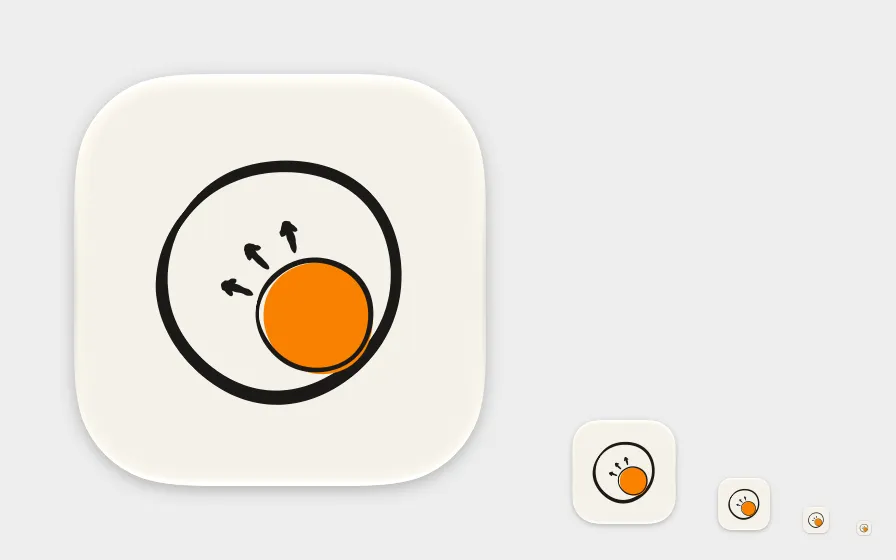
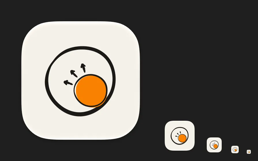
The old identity was still everywhere after the rename: an orange ball on the site, and the branch tree in the Mac app, sign-in icon and brand docs. All of them now use the Napdock mark, a hand-drawn dock whose orange orb pushes outward with three short arrows. A bolder cut without arrows is used at 32px and below.
macOS 26 and later draw an icon that has only an icns file small on a grey plate. Packaging now also ships a compiled Assets.car named by CFBundleIconName, with icon.icns kept as the fallback for older systems. The site’s header mark follows light and dark themes while the orb stays orange.
bun run brand:icons renders every export from the vector masters in assets/brand/napdock. The Mac icon shots are the system’s own rendering, not a Dock screenshot.
In the app